


 I'm a happy reader. I asked the library to order this a couple months ago and put it on hold for me. So I'm first in line! I picked it up yesterday and haven't been able to sit down to read. But I did look through the front and back matter while we were at the doctor with Pearl (getting a cast on her soccer thumb), and was disappointed because I expected a written apology or at least an explanation for why it took Donna Tartt 11 years to write this book. That's 69.9 pages per year, 5.8 pages per month, 1.3 pages per week, or 1/5 page each day. Hm. A paragraph a day. I could try that.
 If I got a chance to interview Donna Tartt, I'd try to get her to confess that she wrote the whole thing in the last two years. Also, has she signed a contract for the next book? And how painfully long is she planning on dragging that one out? Does she sketch out the lines she is going to use to delay her editor? Does she laugh out loud or just inside when she's spending her advance?
It's the most spartan book design I've seen in ages. Nothing on the back jacket flap, very plain design! The same bio we've been seeing on anything Tartt since [b:The Little Friend|775346|The Little Friend|Donna Tartt|https://d202m5krfqbpi5.cloudfront.net/books/1327936589s/775346.jpg|1808852] came out in 2002.
Real-size Farm Animals
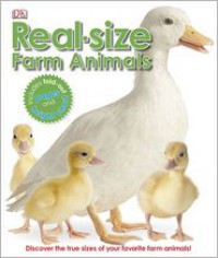 So this morning, Alma saw this book as Nancy was putting his coat on. The bus was waiting out front. He leaned over to have a look, and Nancy had to pull him away to take him out to the bus. He got really mad at her. I'll have to leave it out for him this afternoon. It's already a well-loved copy from Poudre Libraries, with a lot of rips from vigorous page turning. Alma will probably help that along a bit...we'll have to read it with a roll of tape.
 This is not an Eyewitness book, but uses all the tools we expect from a DK book in that series: The white background providing contrast for original photos. This book also has an original spot illustration for each animal, along with the usual raft of templated text features providing a differentiated reading experience.
The idea of "real-size" animals was fun to see. Greenwood is borrowing from Steve Jenkins' idea, but has used photography instead of illustrations for the life-size animals. The main central photograph is to-scale. On a couple of pages, the pig and the donkey, they used fold-outs to expand the scope of what I could see.
Ant Colonies
 Powerkids (a subsidiary of Rosen), subcontracted with British book design team Calcium Creative for this series. Calcium contracts with a long list of the series publishers. This seems like an interesting way to do business. They can put their effort into finding good ideas and making the books, or on getting ideas from other companies' editors and pitching them a concept for the series.
 The idea behind the six in this series is animals that travel and work in groups--an interesting science concept to follow (ants, chimps, dogs, dolphins and whales, and lion prides are the others in the series).
While specific graphic designers are credited, this book gets more of the template treatment than original design throughout the book. The designers created a style guide and templates and then manipulated this for each spread. Given the stock photos, there is pretty good variety in what I get to see of wolves in color, composition, and content (the photos on the page about marking territory were unfortunately non-specific ;-) ). Again, I'm surprised at how a focused topic can have such depth in the stock photo library to support a whole book.
The text is unremarkable, but does offer three different levels of complexity--captions (10-15 words), small vignettes (35-40 words), and body text (2 simple paragraphs). The vocabulary and sentences are complex enough to allow for some interest to come from the text, but still very bare bones description with little voice.
Wolf Packs
 Powerkids (a subsidiary of Rosen), subcontracted with British book design team Calcium Creative for this series. Calcium contracts with a long list of the series publishers. This seems like an interesting way to do business. They can put their effort into finding good ideas and making the books, or on getting ideas from other companies' editors and pitching them a concept for the series.
 The idea behind the six in this series is animals that travel and work in groups--an interesting science concept to follow (ants, chimps, dogs, dolphins and whales, and lion prides are the others in the series).
While specific graphic designers are credited, this book gets more of the template treatment than original design throughout the book. The designers created a style guide and templates and then manipulated this for each spread. Given the stock photos, there is pretty good variety in what I get to see of wolves in color, composition, and content (the photos on the page about marking territory were unfortunately non-specific ;-) ). Again, I'm surprised at how a focused topic can have such depth in the stock photo library to support a whole book.
The text is unremarkable, but does offer three different levels of complexity--captions (10-15 words), small vignettes (35-40 words), and body text (2 simple paragraphs). The vocabulary and sentences are complex enough to allow for some interest to come from the text, but still very bare bones description with little voice.
Biggest, Baddest Book of Beasts
 The stars in this series come from Anders Hanson's design. The credit shows him as a designer at Mighty Media, Inc. Did he pitch the series to ABDO, or did they hire his design firm for the editorial team's concept (Liz Salzmann)? We'll see what I can find out.
 All stock photos and art, but with unique design work on each double-page spread. A general scheme for color and backgrounds provides a consistent feel not only throughout the book, but over the whole series. With this general rule for the look, Hanson (and Mann? did she work with him on design, or did she write the words?) have done a great job providing a cohesive and interesting visual experience.
The text is informative, but not special. Simple factual sentences are either strung together in small 2-4 sentence paragraphs or stand alone as captions. Diane Craig consulted as a reading specialist, and I wonder if she was in charge of keeping vocabulary and sentence complexity low? If not, what was her role?
Biggest, Baddest Book of Warriors
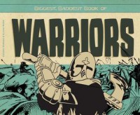 The stars in this series come from Anders Hanson's design. The credit shows him as a designer at Mighty Media, Inc. Did he pitch the series to ABDO, or did they hire his design firm for the editorial team's concept (Liz Salzmann)? We'll see what I can find out.
 All stock photos and art, but with unique design work on each double-page spread. A general scheme for color and backgrounds provides a consistent feel not only throughout the book, but over the whole series. With this general rule for the look, Hanson (and Mann? did she work with him on design, or did she write the words?) have done a great job providing a cohesive and interesting visual experience.
The text is informative, but not special. Simple factual sentences are either strung together in small 2-4 sentence paragraphs or stand alone as captions. Diane Craig consulted as a reading specialist, and I wonder if she was in charge of keeping vocabulary and sentence complexity low? If not, what was her role?
1 Cookie, 2 Chairs, 3 Pears: Numbers Everywhere
 I was so relieved this wasn't a rhyming book! Brockett's voice is strong, adding a feel with descriptions instead of mere labels. And her original photos were interesting to look at (although I thought she turned to her needlework and craft projects too often). It would be a fun read aloud. Also noteworthy is that she goes up to 20 instead of 10.
What's Up, Cupcake?: Creating Amazing Cupcakes
 So I've been thinking about recipe books lately, and the question is the same as for other activity books: is the experience of the book strong without doing the activity? IF not, I can look up cupcake recipes dozens of places online. So a recipe book has to clear not only the internet hurdle, but also the one about the aesthetic experience of reading the book.
I was imagining this book as a read-aloud. I think with the powerful original photos (shot in house at Capstone by Karon Dubke, just as Eric Gohl suggested would be the case) I could narrate my way through the recipe, pointing at the photo as if it were a diagram. Recipes beg to be read aloud with emphatic prosody. Favorite recipe books for me have a strong personal voice and this book was much more bare bones in the writing than I would have liked.
The World in Infographics: the Natural World
 Last summer I went to the Edward Tufte design seminar in Denver, where he discussed design principles as they relate to presenting information and data. Now this is the second book I have seen that uses the infographic style for a whole children's book. While I see some of the most basic techniques developed by Otto Neurath and Gerd Arntz, I wonder whether this book would hold up to Tufte's critiques. One of Tufte's ideas is that the information needs to be as clear and simple as possible, and this book really over-uses color and some of the information is more difficult to follow because of the complicated design.
 But at the same time, the use of the full page to organize a flow of information in different graphic ways is unusual for children's books, which are usually dominated by a template-like approach to each double-page spread. This book at least owns up to the fact that each double can offer a new kind of visual experience, which is unusual for informational books. Richards and Simkins in this series of four books realize that the nature of the information should determine the layout of the page. Richards worked for DK in the past, so this is an interesting departure from the template-style he must be familiar with from working there.
Horrible Hauntings: An Augmented Reality Collection of Ghosts and Ghouls
 Bridges provides a very basic overview of ten specific historical ghost stories. The words begin with a narrative hook, followed by summary of the historical account. Each double has a full-page illustration that seems to be just a blank picture of a setting. But these blank settings are the backdrop for use by a phone app to create an augmented reality. The first one was probably the best, where hovering the app over the book makes a 3-D image of a ghost ship appear.
 I haven't seen a lot of Augmented Reality books, but my 8-year-old daughter sometimes plays with the AR on her Nintendo 3DS. The games aren't very well developed, so she doesn't play with them often. I'd like to see more of this.
The technology makes it into an activity book more than an aesthetically experienced piece of art work. It's what the book prompts you to do that creates the experience, more than the book itself.
It looks like Bridges cooperated with a relative to get the app developed. The concept makes it easy to discuss the modern and post-modern. Making a book interact with a smartphone or tablet is a clear use of recent modern technology. But one of the things that happens with the 3-D images in the app, is that they appear to pop off the page. For example, on the Headless Horseman page I can rotate the phone and see the image off the edges of the page. It makes me attend to the frame of the page in new ways, and also to notice what the background image was like before and after the app interacted with it.
This all begs the question of how illustrator Maughan collaborated with Jason Yim in the development of the app and the painting of the illustrations. Do the illustrations have to meet some kind of technical specs so that the app can 'recognize' which animation it is supposed to bring forward? How is this information coded in the illustration? Or did the coders simply use existing illustrations and write code to recognize them?
Ghost Hunters
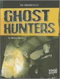 This series book (with 5 titles) provides a basic overview of its title subject. I was worried it would have little beyond the Wikipedia page on Ghost hunting. But there was a good page on electronic voice phenomena (which interestingly, is not featured on the wikipedia page), and the process of setting up a ghost hunt was given in a narrative storytelling voice here where this process is given in plain description online. Andrew Nichols was the consulting expert on the project (his chapter was one of the more interesting in [b:Ghosts, Specters, and Haunted Places|16235502|Ghosts, Specters, and Haunted Places|Michael Pye|https://d202m5krfqbpi5.cloudfront.net/books/1356073761s/16235502.jpg|22237567]).
 One of the interesting things about these books is that 'skeptics' are usually given no face and are thus an impersonal antagonist, easy to dismiss. On the wikipedia page, however, the work of Benjamin Radford is cited directly and explicitly, giving skeptics a face and name. This book leaves them as faceless naysayers.
The photo sources for this series book are interesting, because Svetlana Zhurkin went to multiple news photo outlets instead of stock photos. Two had permissions that led closer to primary sources, including L'Aura Hladik and the Friedrich Jürgenson Foundation.
 When I was young I learned to be disappointed by children's dictionaries and encyclopedias. They are usually condescending in content and tone. For example, one of the key facts of English is the multi-faceted definition. This book only allows 2. I liked the fact that it includes 13000 words, but I don't know how the selections were made be cause there are no editorial notes about process anywhere on or in the book. Oh, the back cover does tell me there are 1500 photos and color illustrations, but nothing about what they decided to in/exclude by policy. Part of the charm of a dictionary is the odd words you encounter on the way to the one you are looking up, and really that is the main value of a print dictionary at all today--it has to offer better or more experience than looking up a word online. This kind of book is rapidly becoming dated, especially since it pares out so many of the words in a regular dictionary. Wasn't a fan before, even less now.
 Parra's folk-style illustrations were fun to look at. I am still thinking about the pages where he did a bird's eye view of a town square and park. but the pictures did not salvage the experience of the book.
 There was no reason this book needed to rhyme. Many of the rhymes felt forced and distracted from the presentation of everyday culture through the lens of a shapes concept. Also, the fact that Thong started with 'round' instead of 'circle' made me expect to read about more generalized shape concepts like round, angular, zig zag, curve. That would have been a fresh take instead of the same old shape catalog.
Ghosts, Specters, and Haunted Places
 This book grew on me after reading a few chapters. Its awkward formatting as an edited volume made it difficult to get into at the start. Each expert chapter follows a different kind of outline structure, some just using plain text, others using headers, and still others using outline structures. A graphic designer might have helped readers find and see similarities across chapters with a consistent visual approach.
 There is wide variety in what counts as an 'expert' here, with some contributors showing little more than reviewing existing accounts of the paranormal while others discuss their own field work in some detail. Overall, the editors made sure the whole text was good at describing what field work might look like, and at challenging popular assumptions and biases about field research.
Author credentials for each contributor are given at the back of the book. These were easier to critique after recently reading [b:When Can You Trust the Experts?|13838227|When Can You Trust the Experts? How to Tell Good Science from Bad in Education|Daniel T. Willingham|https://d202m5krfqbpi5.cloudfront.net/books/1341581469s/13838227.jpg|19472920]. Essentially, each person's presentation boils down to a 'trust me' moment. As an aesthetic experience, some of these moments were more powerful than others, making for an uneven read. Some felt credible and others hokey.
It is interesting to think about paranormal books as informational text, because of how controversial the question of 'reality' is by comparison to the popularity of the topic. It's not like dinosaurs or the Titanic, where a preponderance of tangible material accompanies the wide public interest--the entire topic is based on a body of reports and narratives. Because it is a perennial topic for publishers, it is very interesting to watch the ways authors use thought structures and text formats they borrow from the known informational text genres. In this volume, I feel like I am reading conference proceedings!
Back in the 1800s, authors like [a:Joseph Sheridan Le Fanu|26930|Joseph Sheridan Le Fanu|https://d202m5krfqbpi5.cloudfront.net/authors/1206504583p2/26930.jpg] and [a:Wilkie Collins|4012|Wilkie Collins|https://d202m5krfqbpi5.cloudfront.net/authors/1192222099p2/4012.jpg] were more interested in the narrative and aesthetic value of the paranormal and of dark psychology. Pye and Dalley have ignored the rhetoric that favors the quality of the telling, and instead working to put readers in a frame of mind of scientific or journalistic reading. Just on a reader response level, I'm conflicted about that.
Robot Competitions
 This was a good overview of robotics competitions, with a fine selection of stock photos. Beyond its wide coverage, the best thing is that Forest's book is full of photos, which take the idea of robots out of the hypothetical and into a clearly present kind of reality. And yet...
 I still don't buy that simple remote control machines should count as robots, and that's what more than half of this book is about, so the 'presentness' of robots is misleading in a way. I mean, yes, the wireless remote control is a great invention, but I think there's some kind of presumption that a robot is gathering information through sensors. As one scientist put it, "non-autonomous robots have to spend a lot of time and energy just asking scientists what to do and waiting for the answer." An R/C robot doesn't even gather data and then 'ask questions', it has to rely on a person for its every decision and move.
Are UFOs Real?
 This was interesting, because the overall tone of the book is to tip readers away from believing in UFOs, while attempting to acknowledge the validity of the question. This is unusual, because I think the approach tends to tip the other way--toward wanting readers to believe. (I can see a new Fox Mulder poster mixed with an Uncle Sam poster: I want you to want to believe!) And it is done with some interesting information, in a very compact book for readers in grades 2-4.
 Most of all, I appreciated the fact that Portman was taking a historical approach to why the perennial topics are there and where they came from (how we started saying "flying saucer" or why the "weather balloon" explanation became a thing). The selected photos and art all felt consistent with the approach to the topic as a historical overview. There is no credited media researcher, so I wonder whether Portman was in charge of this himself, or if it was Kate Reynolds (designer) or Therese Shea (editor), or whether they just don't credit other staff at Gareth Stevens the way I'm seeing in books from other publishers.
The last page was really funny! It's a bar graph showing almost 8500 reports of UFOs in the past 4 years out of California. Over twice the number as the next states (New York, Florida, and Texas each have fewer than 4000 in the same time period.) Something about California!